Vitra Design Museum, Weil am Rhein, Germany
Until 14th May 2023
Until 14th May 2023

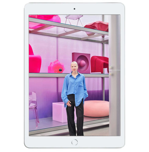
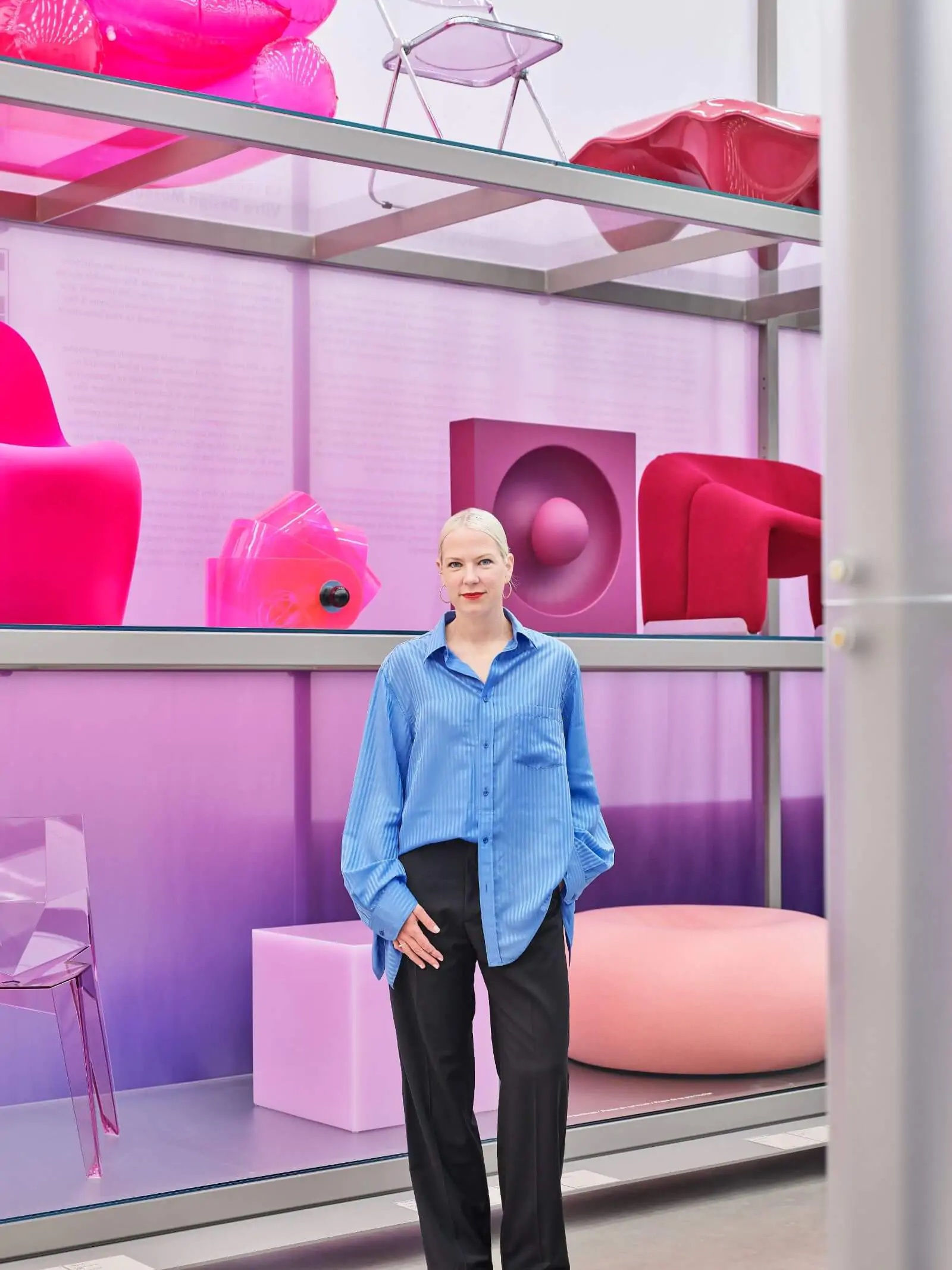
DUTCH DESIGNER SABINE Marcelis has reinterpreted Vitra Design Museum’s famed furniture collection through an immersive, thematic display that is a bold celebration of colour. Titled ‘Colour Rush!’, the exhibition takes place in Vitra Schaudepot – a red brick building by Herzog & de Meuron on the sprawling Vitra Campus in Weil am Rhein, Germany, close to the Swiss city of Basel.
Marcelis, 33, who runs a product design studio in Rotterdam, has selected around 400 works from Vitra’s collection of 7,000 furniture pieces, from the 19th century until today, reinterpreting design history by organising the pieces chromatically. Her approach draws attention to the different production processes and materials within each tonality. This is the second conceptual presentation of the museum’s collection, following last year’s on women designers.
The museum invited Marcelis to bring this sweeping visual perspective after acquiring ‘Candy Cube’ (2014) – her hollow resin cube in lustrous marshmallow pink – a couple of years ago. “It was part of a group of acquisitions by female designers because I think they [Vitra’s curatorial team] realised that their collection is very male-focused,” Marcelis explains on Zoom.
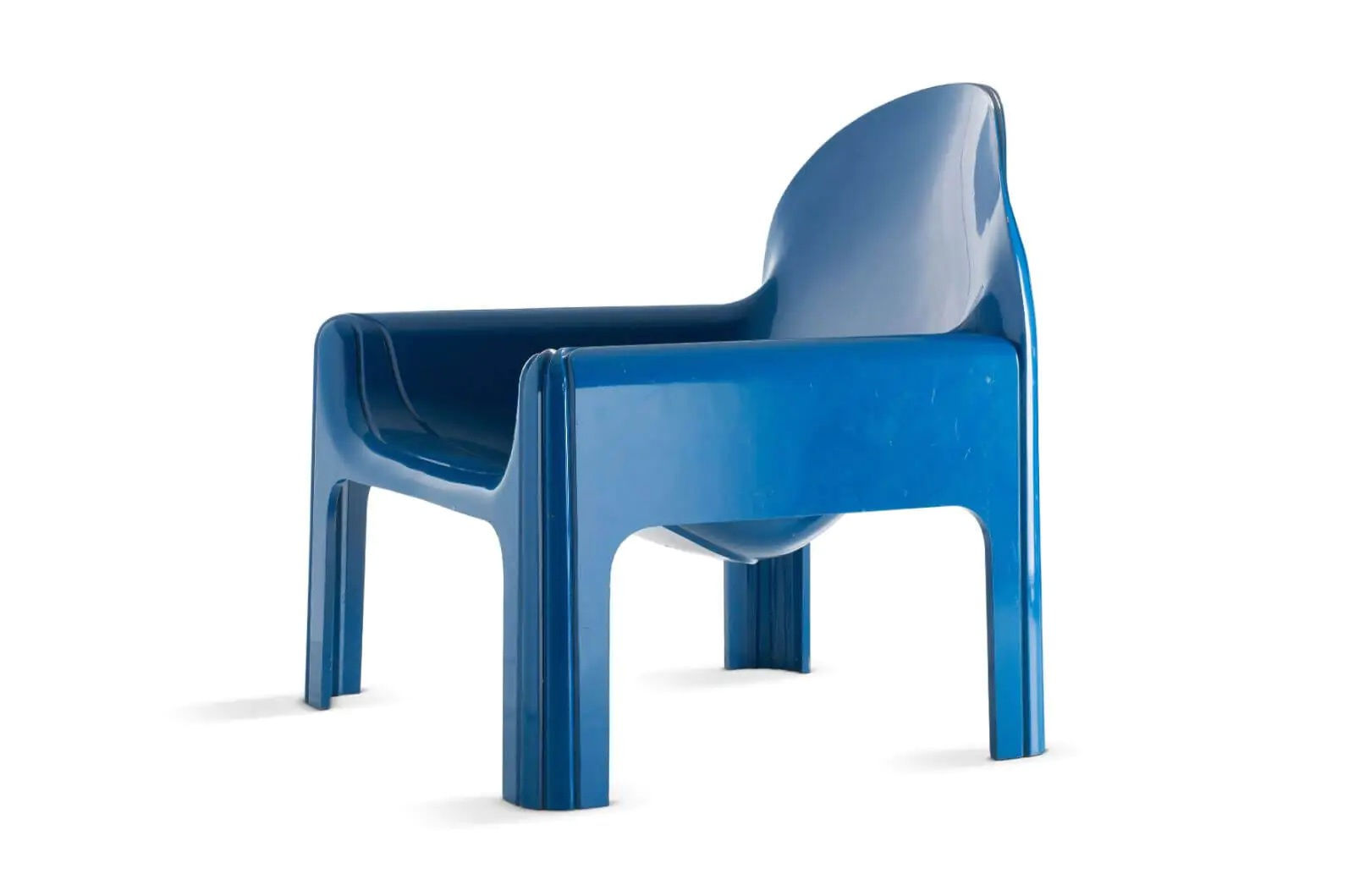
Marcelis made ‘Candy Cube’ after graduating from Design Academy Eindhoven in 2011. Ambiguous in form, as it could be used as a seat or a table, and produced in a range of translucent ice-cream colours, it brought her international acclaim. “People [who] have acquired it [have placed it] into really modern homes but also castle-like interiors; it’s been used in fashion stores, and a pop star took it on her world tour,” says Marcelis excitedly, referring to New Zealand singer/songwriter Lorde (Ella Marija Lani Yelich-O’Connor). “I love that people find their own meaning in it,” adds Marcelis, who grew up in New Zealand.
How did Marcelis react when Mateo Kries, Vitra Design Museum’s director, asked her to reimagine the presentation of its furniture collection? “It’s something that I’ve never done before, so it sounded like a fun challenge but it was a little bit daunting at first because of the museum setting,” recalls Marcelis, who is known for her ongoing experiments with materials, light and colour.
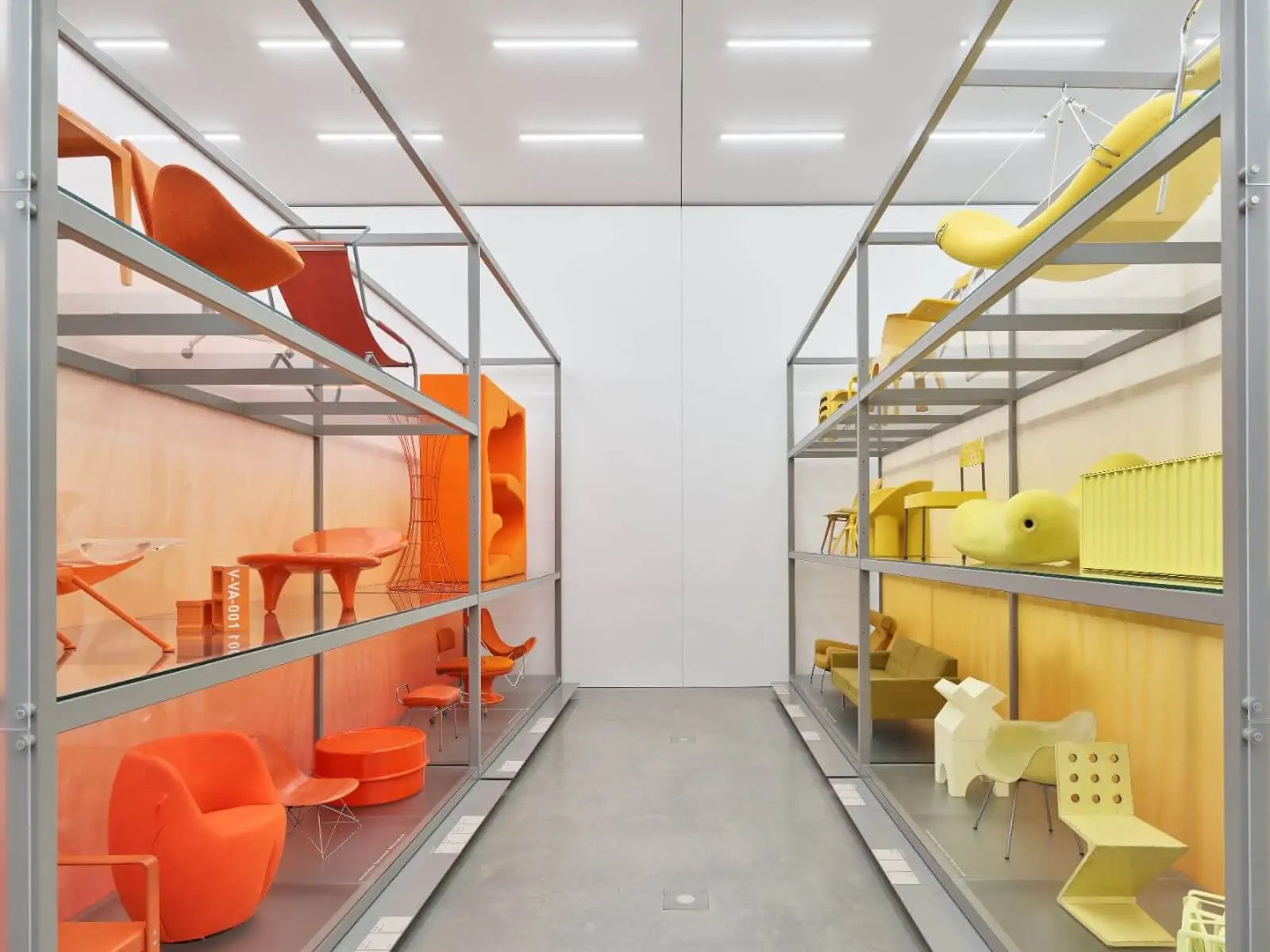
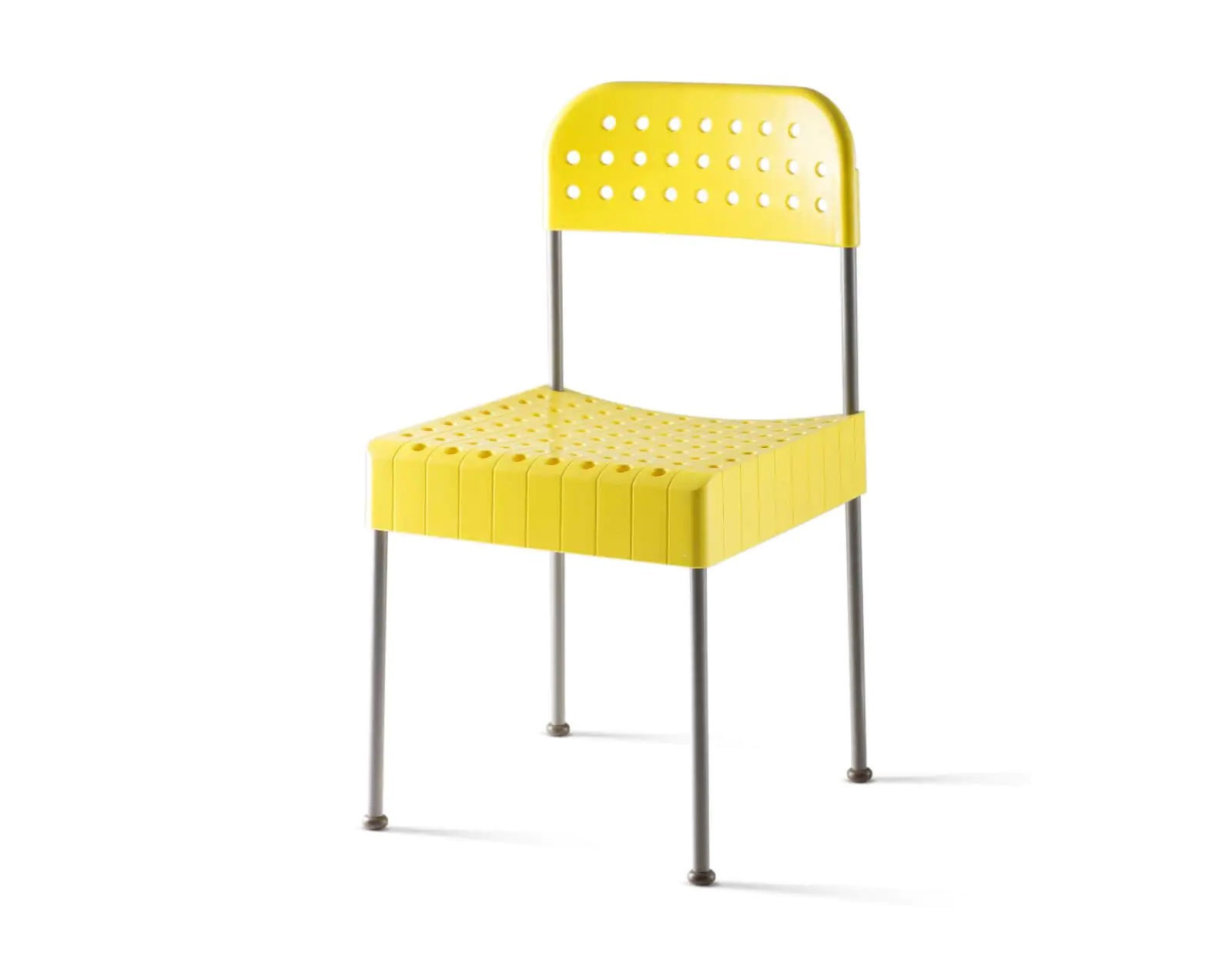
Aiming to make “a singular statement” by eschewing patterns or multicoloured pieces, Marcelis placed yellow, orange, red and brown works on one side of the space and blue, pink/purple, green, white and metal works on the other, ranged against coloured backdrops. Black furniture runs across the end wall behind a podium of transparent pieces. Bringing a conceptual gravitas to the exhibition is a range of colour wheels, such as that of Pantone, and cerebral studies by Verner Panton, Alexander Girard and Hella Jongerius.
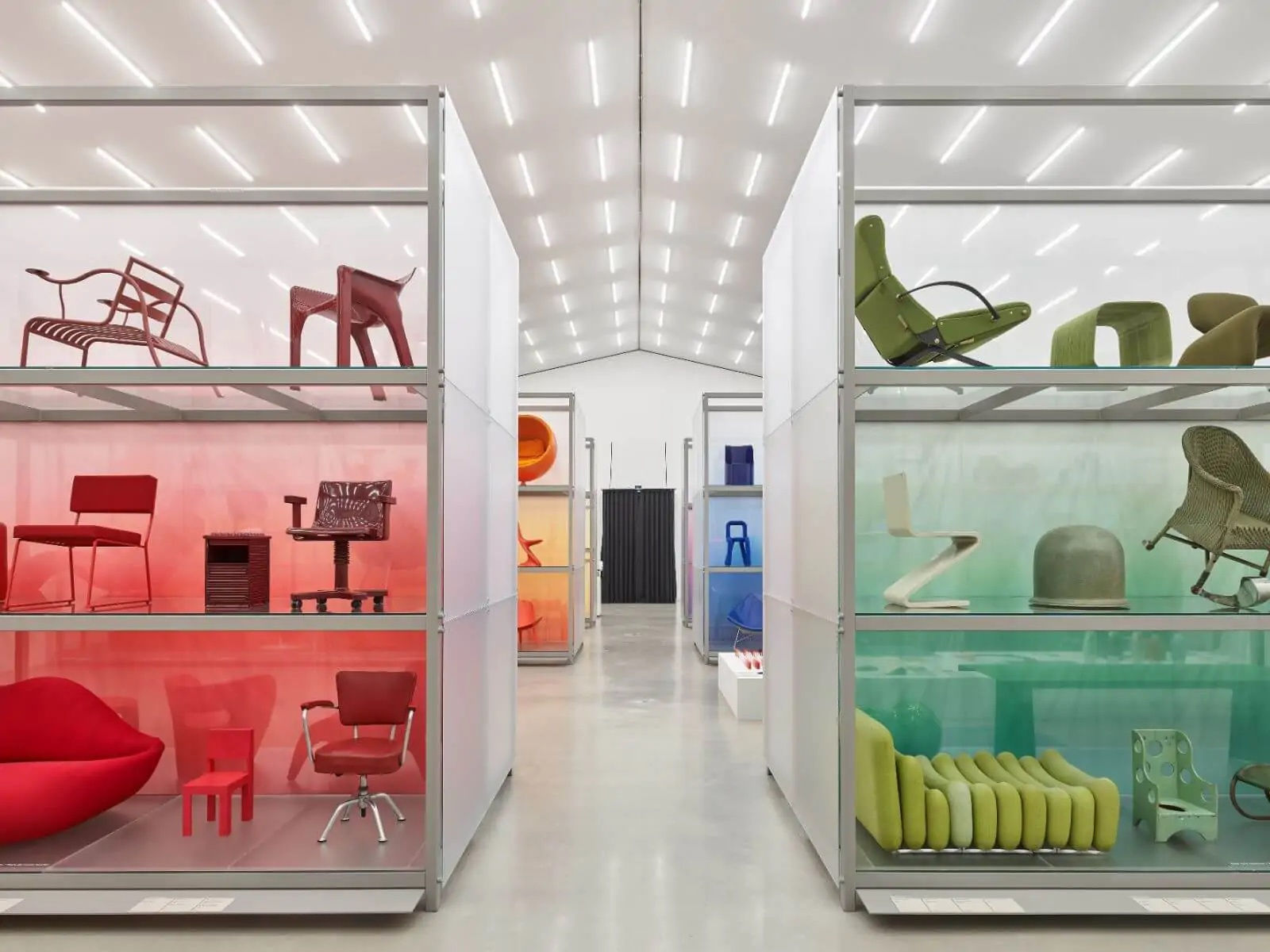
“It was very obvious that before the 1960s not a lot of colour was used and then there was an explosion of colour,” recounts Marcelis, observing that the breadth of hues differs immensely from one colour to the next. “There are lots of different types of green but only one type of orange. We’re constantly exposed to all sorts of green in nature, but orange is less present. So what we experience in life relates to how we can imagine a colour in objects.”
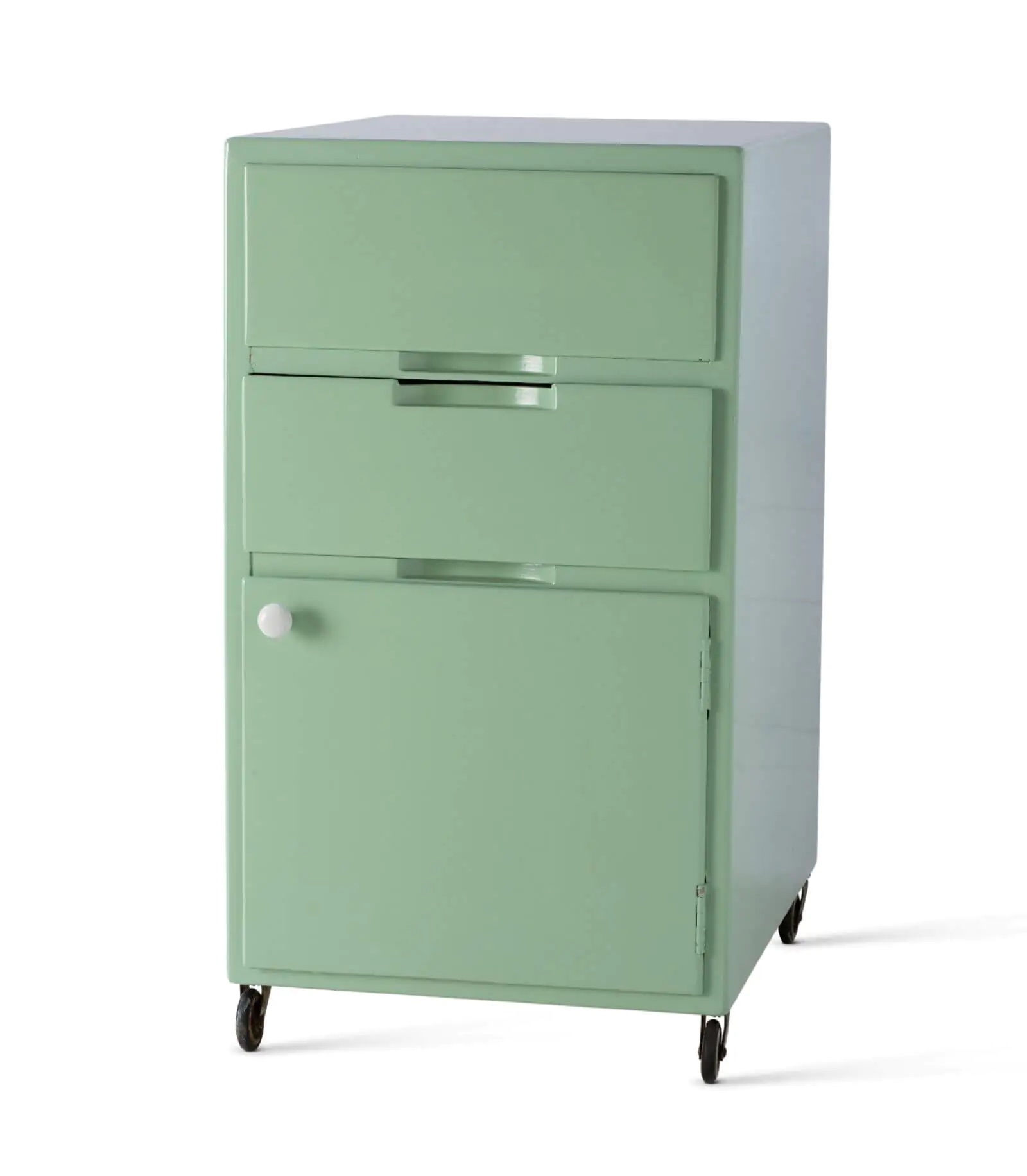
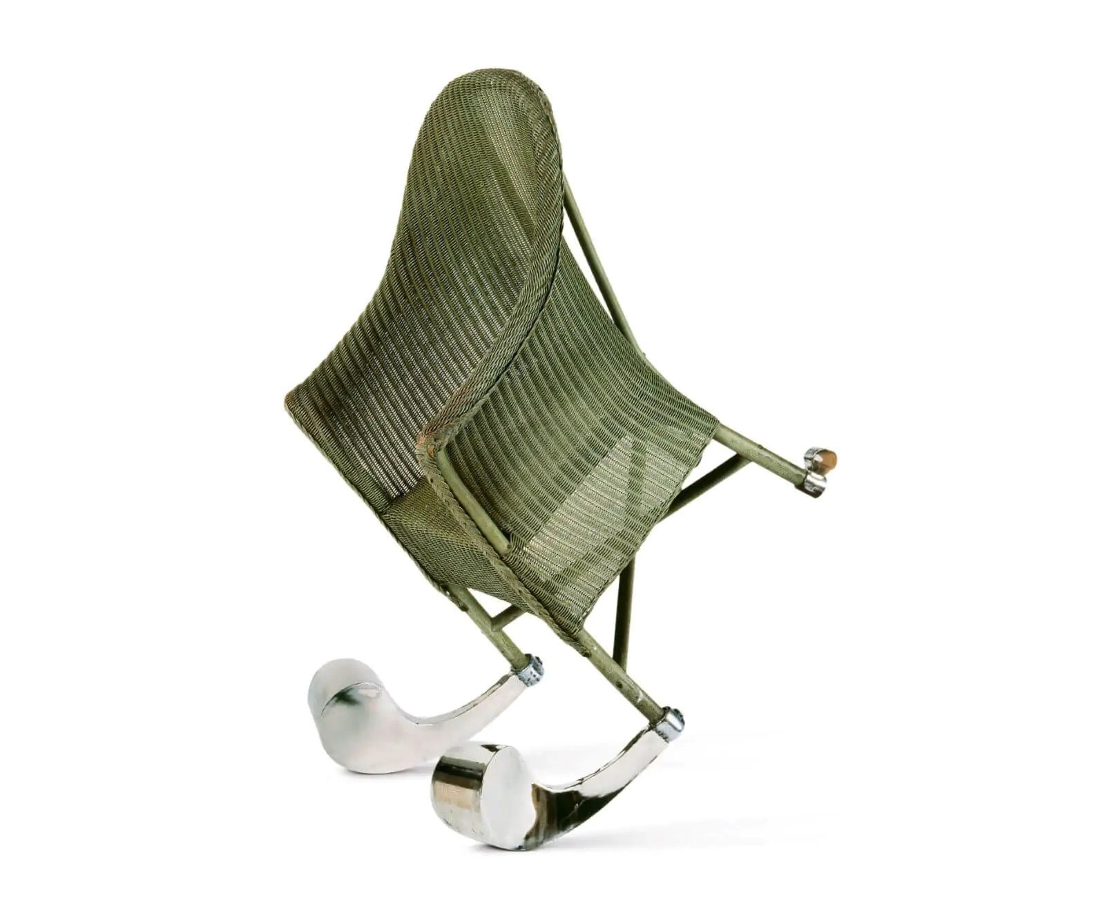
For the green section, therefore, Marcelis, who collaborated with curators Susanne Graner and Nina Steinmüller, proceeded by sequencing ‘waves’ of colour. This sees Alvar Aalto’s ‘Bedside cabinet’ (1931-1932) for the Paimio Sanatorium in soothing minty green near Ron Arad’s ‘Looming Lloyd’ (1989), a wicker armchair in painted grass green with clunky stainless steel front feet – a humorous metaphor for a wobbling person.
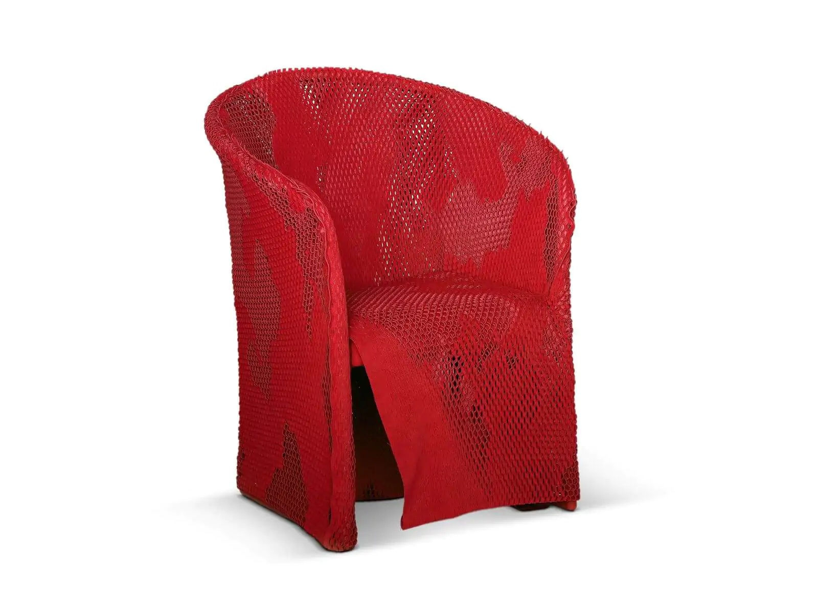
Inevitably, the red section is where one finds passionate pieces such as Studio 65’s red-lipped sofa, ‘Bocca, Marilyn’ (1970). It is in the striking company of Shiro Kuramata’s tall, sculptural ‘Revolving Cabinet’ (1970), Ettore Sottsass’s ‘Valentine’ typewriter (1969) and Tokujin Yoshioka’s experimental ‘Kimono Chair’ (2007), made of lacerated, blood-red fabric draped over a steel frame.
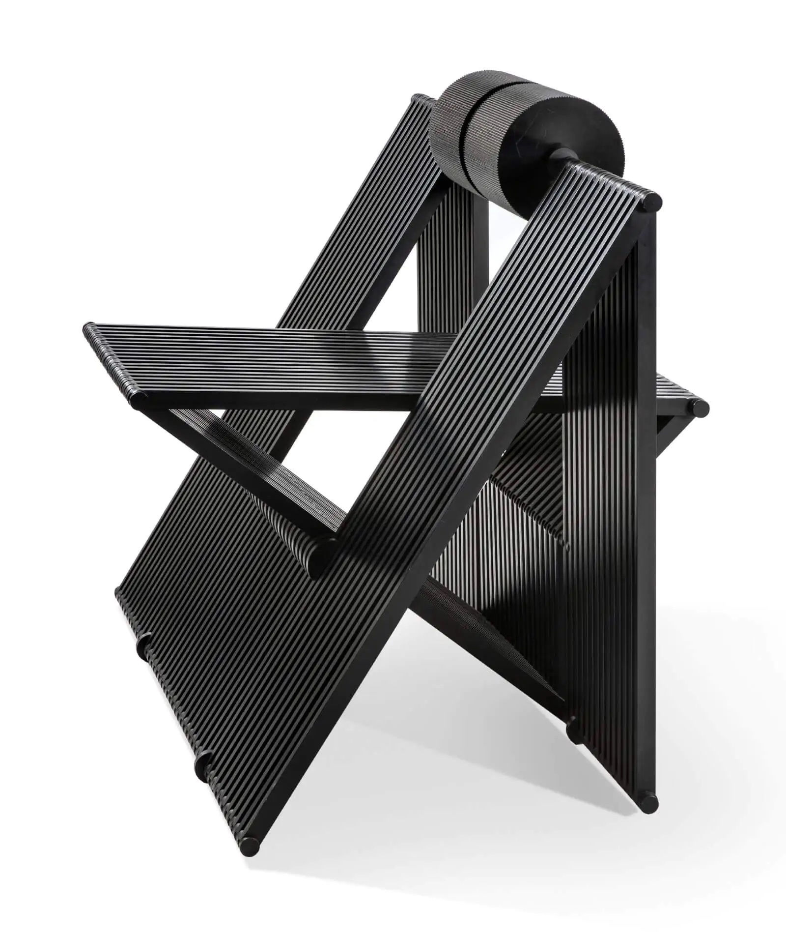
While many of the works are familiar to design enthusiasts, there are plenty of discoveries. One such highlight is Stefan Wewerka’s ‘Classroom Chair’ (1970) – a black chair slouching to one side, mimicking the gesture of a bored teenager. It contrasts with its neighbour, Mario Botta’s ‘Quarta’ (1984) – an aluminium seat pivoting out of a ribboned structure, like a transparent element in a building.
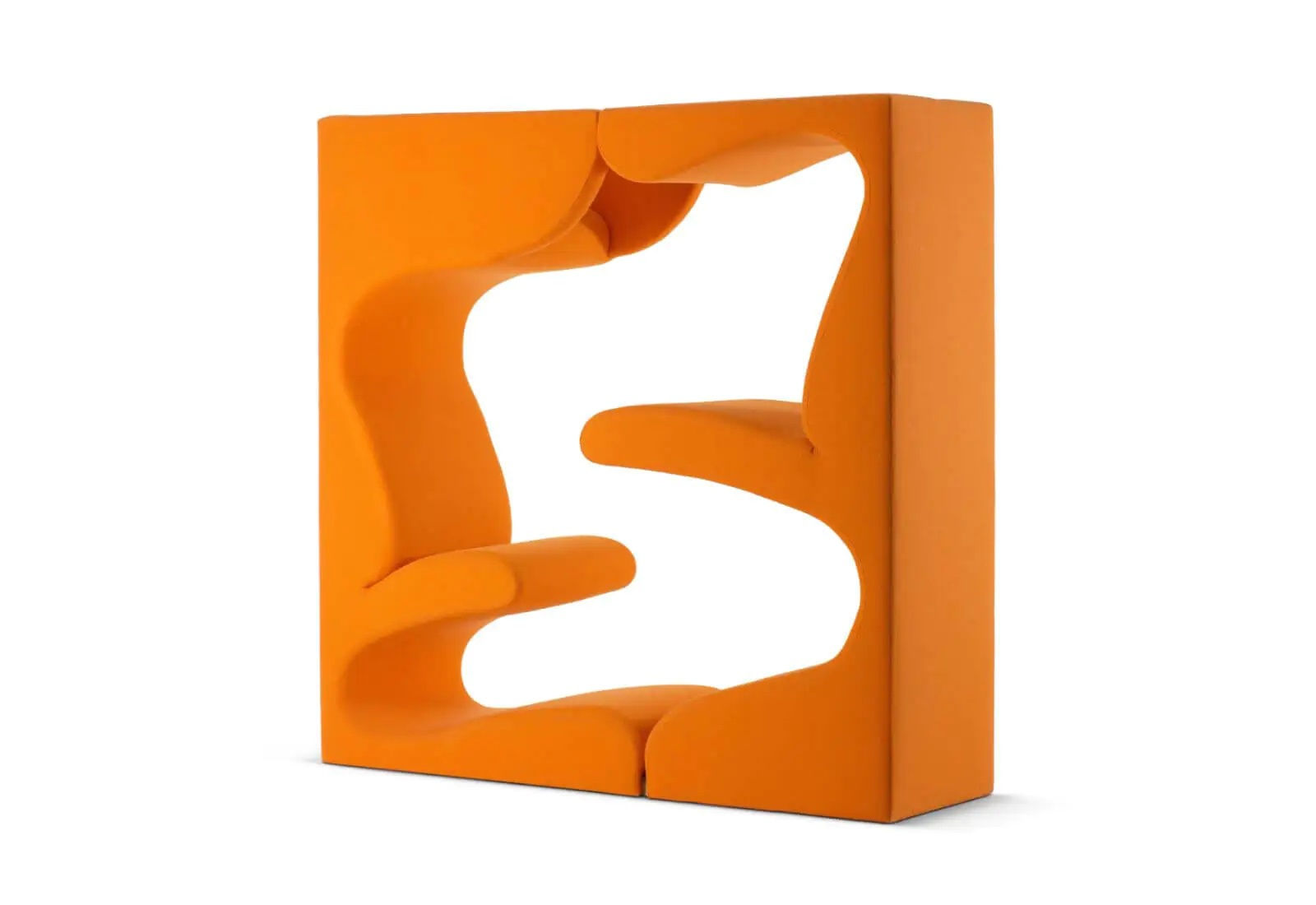
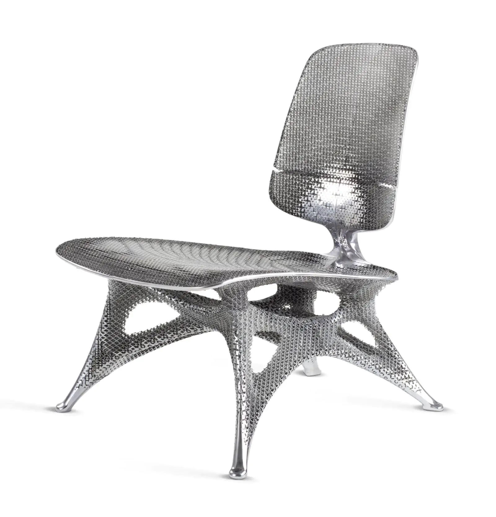
Among the myriad pieces, Marcelis admits to having a few favourites. “I really like Verner Panton’s ‘Living Tower’ [a cube-shaped sculpture with two seats inside the negative space, 1968-1969] because it’s about how people sit together on an object,” she says. Her other standouts include Joris Laarman’s 3D-printed ‘Aluminium Gradient Chair’ (2013) and Gerrit Rietveld’s lemon perforated ‘Zig-Zag’ chair (1934), which Marcelis describes as “revolutionary for its time”.
Has working on the show influenced Marcelis’s perception of colour? “Maybe it’s made me more perceptive about how other designers work with colour. I notice myself looking at designs and almost placing them in the exhibition, thinking: ‘Oh, this could have worked well’,” she replies, laughing.

The museum invited Marcelis to bring this sweeping visual perspective after acquiring ‘Candy Cube’ (2014) – her hollow resin cube in lustrous marshmallow pink – a couple of years ago. “It was part of a group of acquisitions by female designers because I think they [Vitra’s curatorial team] realised that their collection is very male-focused,” Marcelis explains on Zoom.

Marcelis made ‘Candy Cube’ after graduating from Design Academy Eindhoven in 2011. Ambiguous in form, as it could be used as a seat or a table, and produced in a range of translucent ice-cream colours, it brought her international acclaim. “People [who] have acquired it [have placed it] into really modern homes but also castle-like interiors; it’s been used in fashion stores, and a pop star took it on her world tour,” says Marcelis excitedly, referring to New Zealand singer/songwriter Lorde (Ella Marija Lani Yelich-O’Connor). “I love that people find their own meaning in it,” adds Marcelis, who grew up in New Zealand.

How did Marcelis react when Mateo Kries, Vitra Design Museum’s director, asked her to reimagine the presentation of its furniture collection? “It’s something that I’ve never done before, so it sounded like a fun challenge but it was a little bit daunting at first because of the museum setting,” recalls Marcelis, who is known for her ongoing experiments with materials, light and colour.

Aiming to make “a singular statement” by eschewing patterns or multicoloured pieces, Marcelis placed yellow, orange, red and brown works on one side of the space and blue, pink/purple, green, white and metal works on the other, ranged against coloured backdrops. Black furniture runs across the end wall behind a podium of transparent pieces. Bringing a conceptual gravitas to the exhibition is a range of colour wheels, such as that of Pantone, and cerebral studies by Verner Panton, Alexander Girard and Hella Jongerius.

“It was very obvious that before the 1960s not a lot of colour was used and then there was an explosion of colour,” recounts Marcelis, observing that the breadth of hues differs immensely from one colour to the next. “There are lots of different types of green but only one type of orange. We’re constantly exposed to all sorts of green in nature, but orange is less present. So what we experience in life relates to how we can imagine a colour in objects.”

For the green section, therefore, Marcelis, who collaborated with curators Susanne Graner and Nina Steinmüller, proceeded by sequencing ‘waves’ of colour. This sees Alvar Aalto’s ‘Bedside cabinet’ (1931-1932) for the Paimio Sanatorium in soothing minty green near Ron Arad’s ‘Looming Lloyd’ (1989), a wicker armchair in painted grass green with clunky stainless steel front feet – a humorous metaphor for a wobbling person.

Inevitably, the red section is where one finds passionate pieces such as Studio 65’s red-lipped sofa, ‘Bocca, Marilyn’ (1970). It is in the striking company of Shiro Kuramata’s tall, sculptural ‘Revolving Cabinet’ (1970), Ettore Sottsass’s ‘Valentine’ typewriter (1969) and Tokujin Yoshioka’s experimental ‘Kimono Chair’ (2007), made of lacerated, blood-red fabric draped over a steel frame.

While many of the works are familiar to design enthusiasts, there are plenty of discoveries. One such highlight is Stefan Wewerka’s ‘Classroom Chair’ (1970) – a black chair slouching to one side, mimicking the gesture of a bored teenager. It contrasts with its neighbour, Mario Botta’s ‘Quarta’ (1984) – an aluminium seat pivoting out of a ribboned structure, like a transparent element in a building.

Among the myriad pieces, Marcelis admits to having a few favourites. “I really like Verner Panton’s ‘Living Tower’ [a cube-shaped sculpture with two seats inside the negative space, 1968-1969] because it’s about how people sit together on an object,” she says. Her other standouts include Joris Laarman’s 3D-printed ‘Aluminium Gradient Chair’ (2013) and Gerrit Rietveld’s lemon perforated ‘Zig-Zag’ chair (1934), which Marcelis describes as “revolutionary for its time”.

Has working on the show influenced Marcelis’s perception of colour? “Maybe it’s made me more perceptive about how other designers work with colour. I notice myself looking at designs and almost placing them in the exhibition, thinking: ‘Oh, this could have worked well’,” she replies, laughing.
