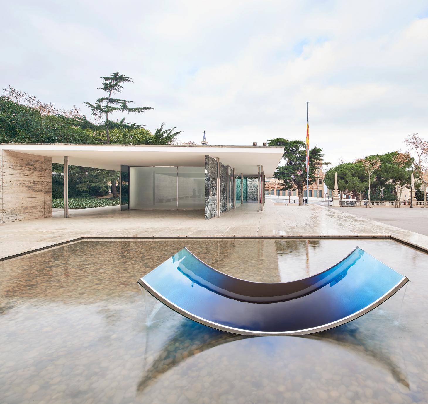
The final piece in the series can be found in the water pond outside: a curved glass fountain that appears to bend the water upwards from the ground, and letting it spill over and back down. Subtle, yet compelling, each of Marcelis’ interventions invite a fresh look at this seemingly untouchable space. Each, in their own way, actually improving it with a 21st century perspective on the modern way.
Dutch designer Sabine Marcelis installs new series No Fear of Glass at the Mies van der Rohe Barcelona Pavilion, adding a new poetic dimension to the modernist structure

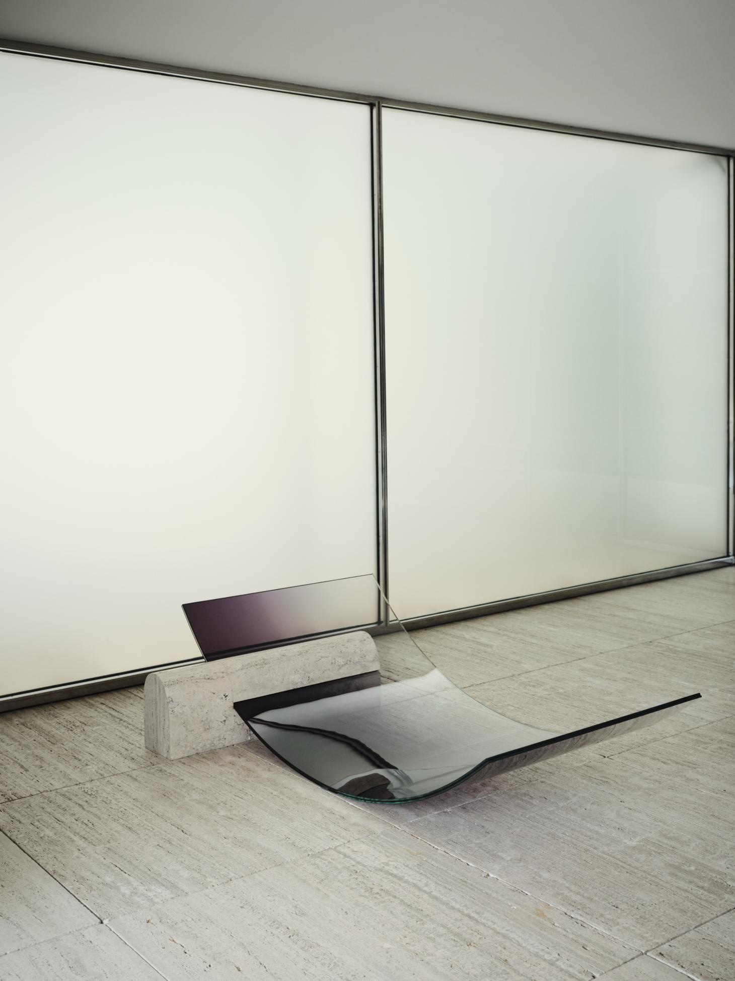
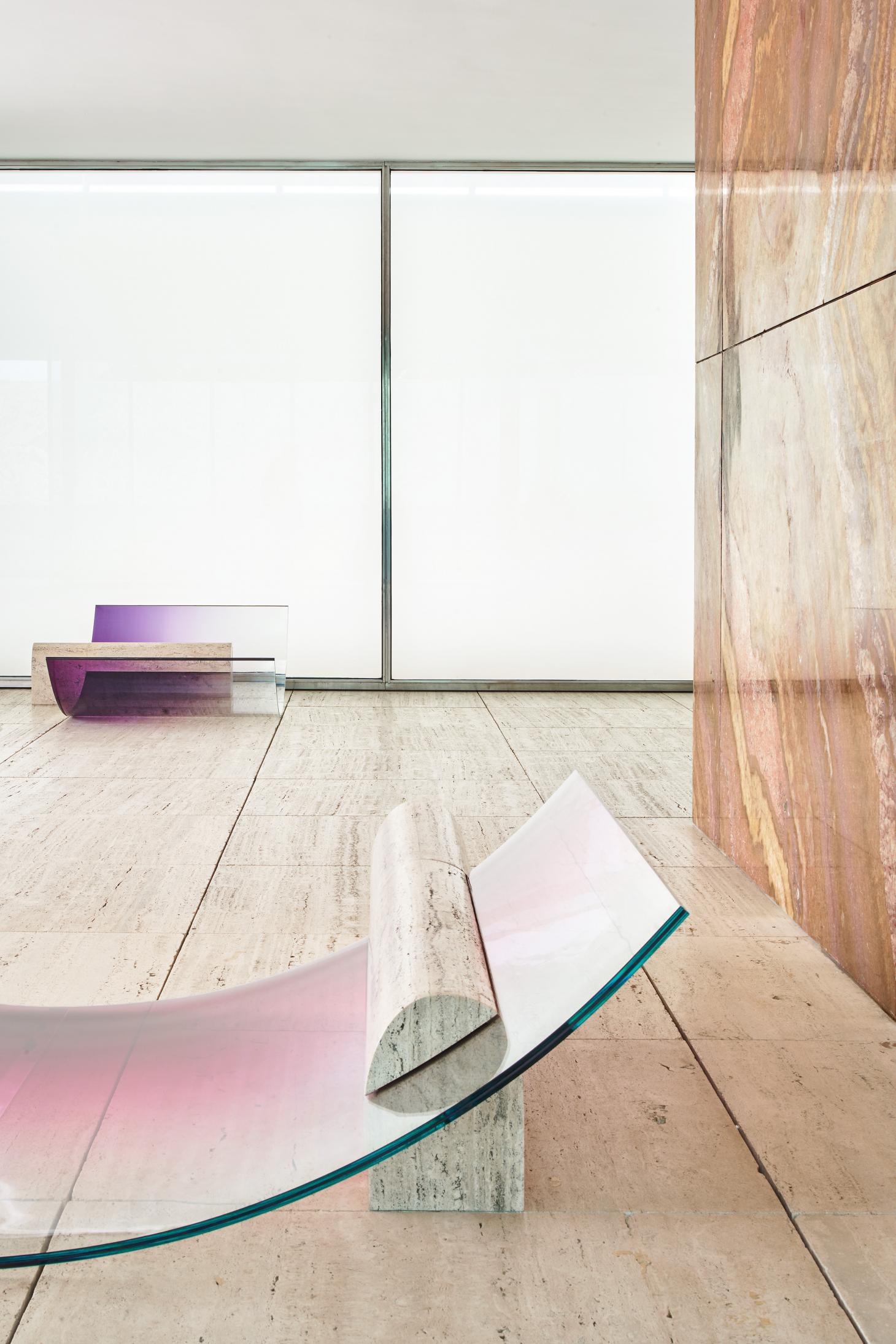
No Fear of Glass by Sabine Marcelis at the Mies van der Rohe Barcelona Pavilion. Photography: José Hevia
Following in the footsteps of Ai Weiwei, Enric MIralles and Ryue Nishizawa, Dutch designer Sabine Marcelis is the latest in a short line of artists with permission to temporarily alter the Mies van der Rohe Pavilion in Barcelona. Her exhibition, presented with Side Gallery and titled No Fear of Glass, includes five new works installed at the iconic architectural structure, and is a beautiful update on Mies’ intention for the space as ‘an ideal zone of tranquillity.’
The Barcelona Pavilion embodies the spirit of 20th-century modern architecture and was first built in 1929. Intended as a reception space for the Barcelona International Exhibition, it was designed to be mostly bare: architecture that was a conduit for the views beyond, a continuous space; blurring inside and outside, containing only the famous (specifically designed) Barcelona chairs and a single sculpture. Since its reconstruction in the 1980s has been a place of pilgrimage for architects from all over the globe.
An intimidating commission, perhaps, Marcelis is an apt choice to take it on. As a starting point, she takes the request made to Ludwig Mies van der Rohe to ‘not use too much glass’ in his construction, and makes the material central to her new pieces. She tests it and pushes it to its limits just as Mies van der Rohe and Lilly Reich did with the other materials in their palette nearly a century ago to test their design ideals.


The result is a series of pieces that seem to be grown and extruded from the structure itself; in glass, travertine and chrome. Two large chaise longues see the travertine floor extended to form a base, which is then sliced by a singular sheet of curved glass. These sculptural yet functional furniture pieces are immediately futuristic, somehow timeless, and extremely inviting.
In response to the eight chrome columns which provide the structural support for pavilion’s roof, Marcelis has also introduced a ninth. In mirrored-glass her vertical structure functions as a light and is placed in line with the existing columns, blending in seamlessly, and adding a new poetic dimension to the space.
The work of Marcelis defies fixed definitions, says Ippolito Pestellini, partner at OMA/AMO and a contributor to an upcoming book that will document the exhibition. ‘For years she has been working tirelessly to push the limits of materials, extending their qualities and performance. What at first glance looks like a purely aesthetic exercise is actually the output of a scientific and systematic research into production processes. The act of design in her practice becomes a different story, one where light, colour, reflection, strength and curvature are the driving categories of a research that is not limited to form and geometry, and that transcends the scale of objects as we know it.’


‘The act of design in her practice becomes a different story,’ Ippolito Pestellini
Curator Maria Cristina Didero also describes Sabine Marcelis’ approach as being unique and highly recognisable: ‘Her design is sharp, severe and at the same time syrupy, honeyed - you might even want to smell or bite her pieces of furniture, which are always extraordinary.’ Consider it a warning. But if you do want to lick it, it’s surely a sign of good taste.


