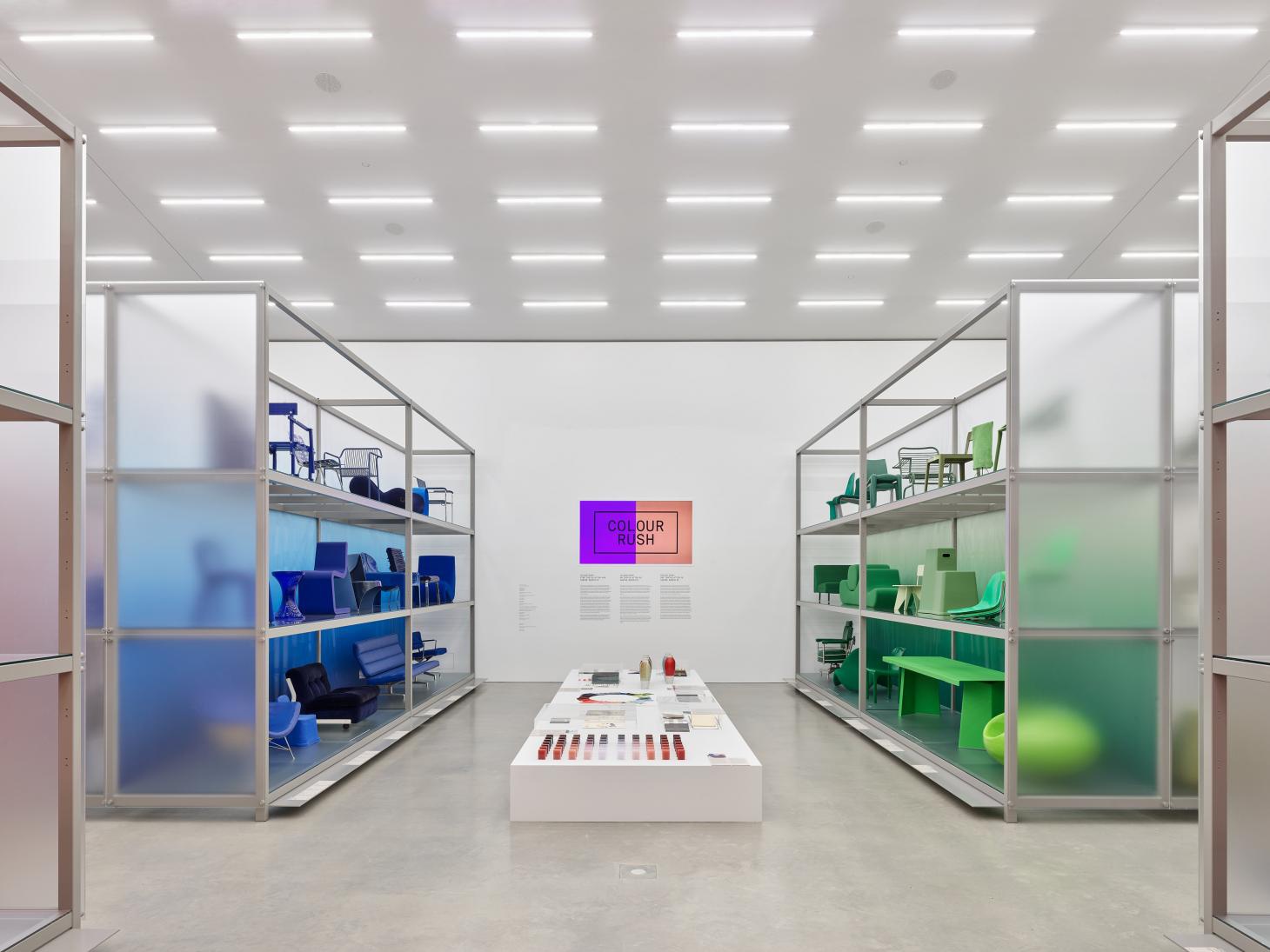
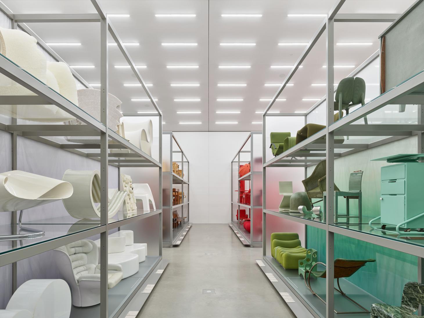
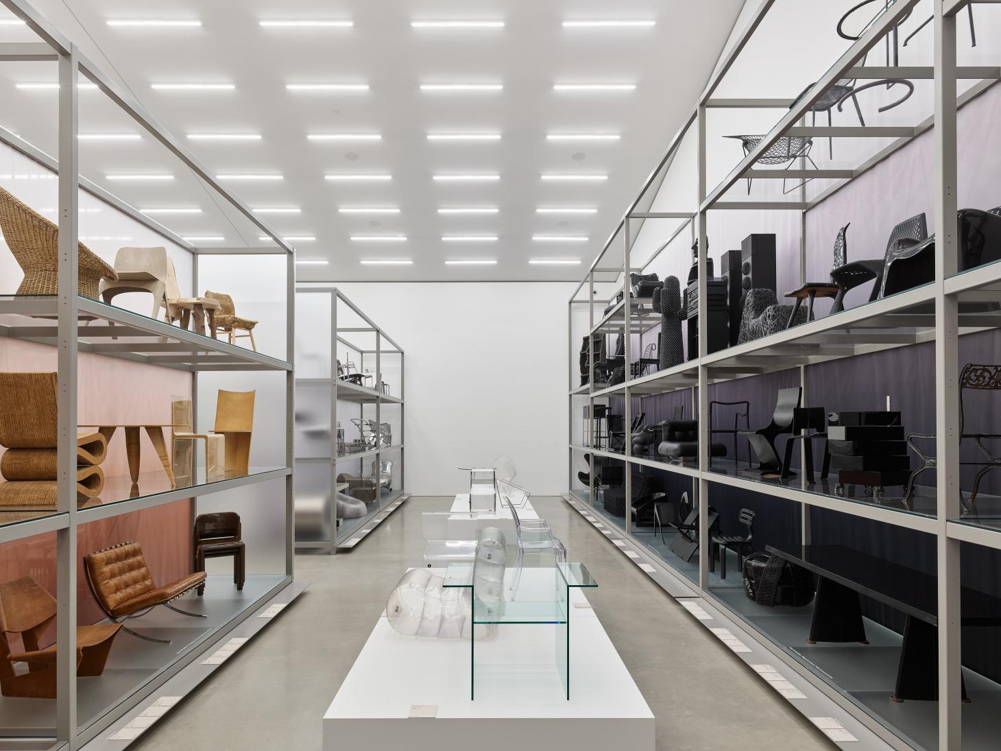
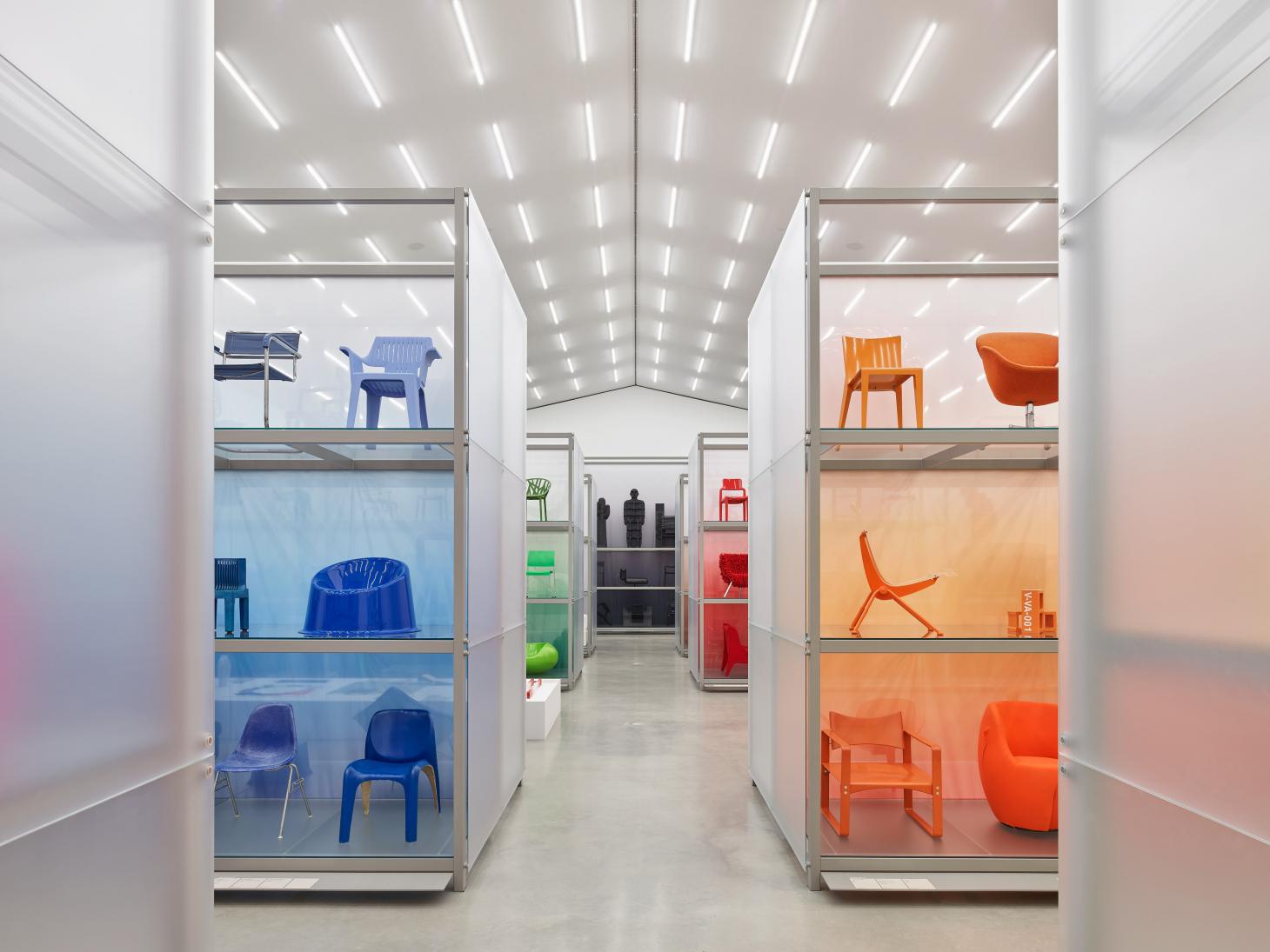
Designer Sabine Marcelis was invited to create an immersive installation for Vitra Design Museum, rearranging its Schaudepot location into a rainbow of furniture (on view until May 2023)
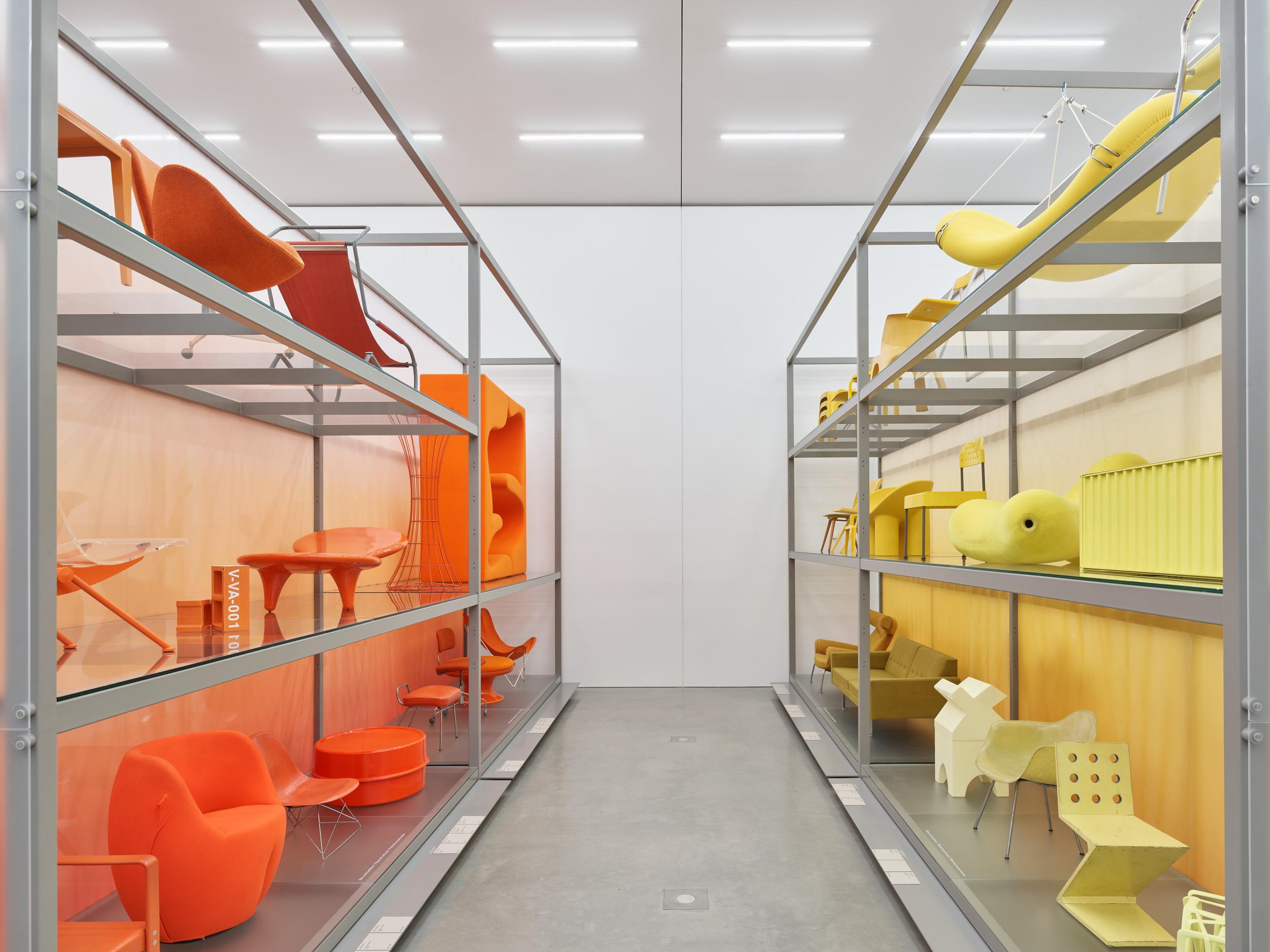
For its annual exhibition at the Herzog & de Meuron-designed Schaudepot, Vitra Design Museum invited designer Sabine Marcelis to explore its archives and create a visually arresting, rainbow-inspired furniture arrangement. Titled ‘Colour Rush!’, the exhibition (on view until May 2023) is a fitting project for Marcelis, whose use of colour is one of the defining elements of her design practice.
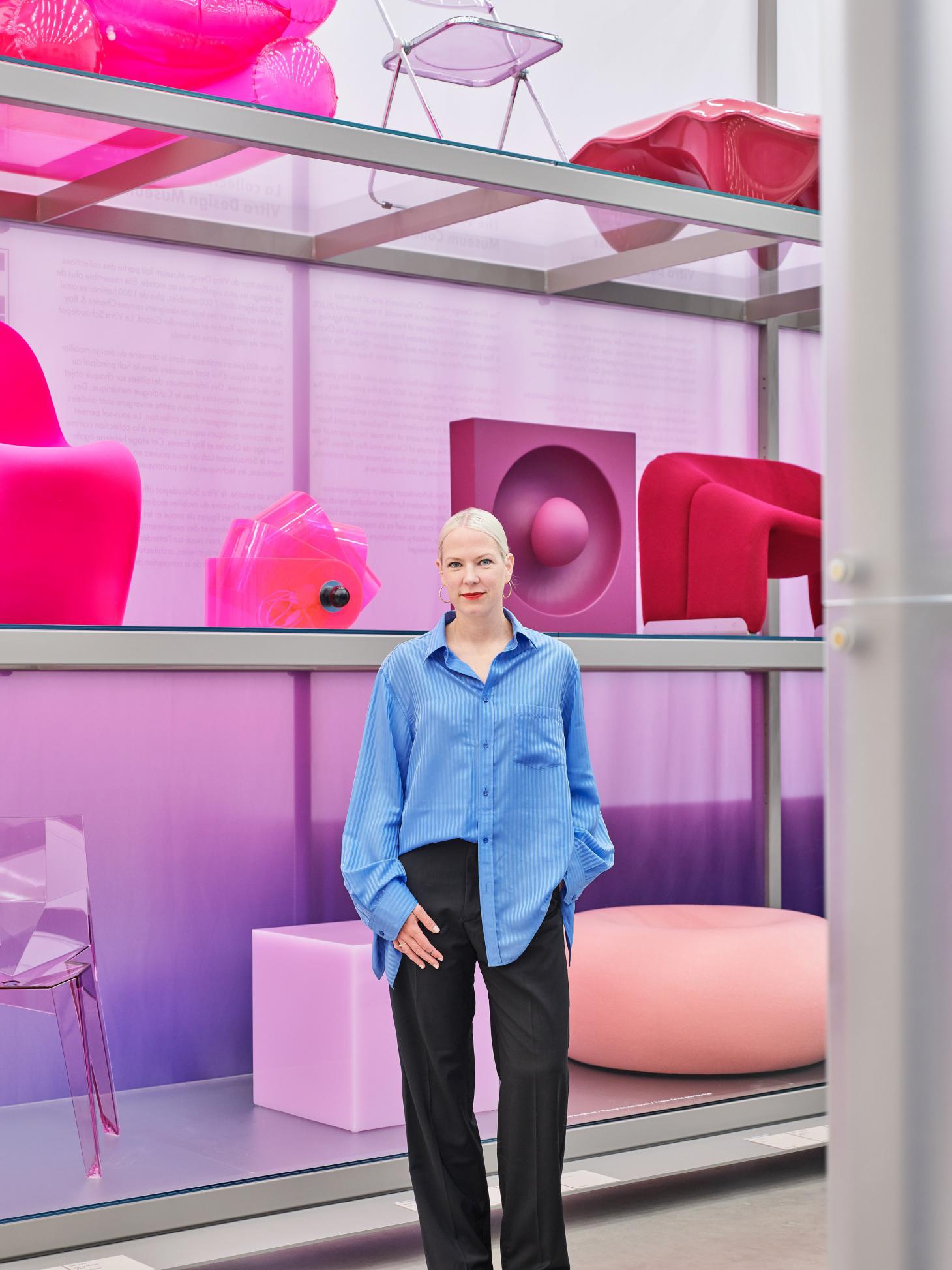
Working with the collection’s curator and almost 400 exhibits, Marcelis focused on colour to present the collection in a new light, eschewing traditional museum display styles to focus on a chromatic narrative. Historical objects and documents from the archives dotted around the exhibition complement the presentation, illustrating how creatives from different eras have approached the theme of colour.
‘Our world is full of colour. Its various shades unleash emotions, assist orientation, indicate functions or perils, and mark cultural, political, professional, or religious identities,’ reads a statement from the museum introducing the project. ‘Although each of us perceives colours in their own way, all times and cultures have symbols and traditions distinguished by specific hues.’
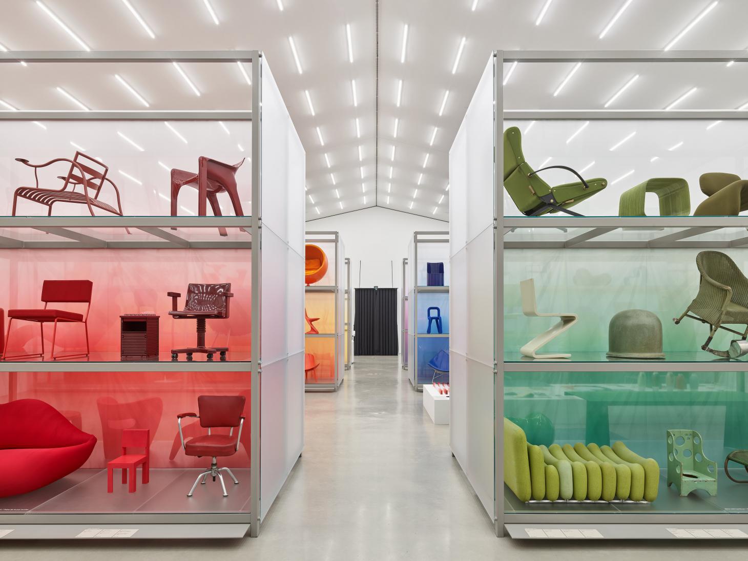
Dubbed ‘an homage to the role of colour in design across all periods and styles’, the presentation transforms Vitra Schaudepot from a functional archive-style space into a chromatic folly, where colour and material take centre stage to form a deeper analysis of our chromatic preference when creating the spaces we live in. Through the contemporary design objects on display, Marcelis makes us reflect on the ways colour has been used by some of the world’s most influential designers. Examples include Le Corbusier’s graded palettes, and the vivid hues of Verner Panton, which helped define 1960s and 1970s interior design. Sketches by Panton are accompanied by further materials from Alexander Girard, Hella Jongerius and more, while a further scientific insight into the topic is offered by a display of standardised colour sorting systems, from RAL to Pantone.
